‘Trust me, try me; you’ll be thrilled with the results, I promise. I’m one of a kind, the best of the kind. You’ll never want to leave me.’ Guess who said this? Well, nobody I know of spoke these words, but their message is conveyed to you silently by each of the products displayed on shop shelves and counters.
This is just the message that ‘branding’ tries to transmit by artfully constructing a unique, distinctive identity using images – a name, symbol, slogan, picture, letter, number, or shape, singularly or in groups of the same or a mixture. Moreover, in an economy characterized by competing goods and services, branding the brand is not a quick, easy task. It demands clever artistry from a range of human resources, including artists, architects (the shopping environment may be part of the brand image, think of Apple, for example), graphic designers, textile designers, industrial engineers, photographers and writers. Psychologists, statisticians, scientists, sociologists and social anthropologists (in light of the semiotic implications) may also be involved in branding.
Not only is branding an enterprising endeavour necessitating a cross-disciplinary approach, it is also a modern art. We should not underestimate its highly developed and sophisticated artistic nature just because the advertising industry, in which branding plays a key role, is sometimes frowned upon as a low-brow form of artistic expression – not quite ‘one of us’.
A product’s visual identity – the look of the mark and linked images – lacks resonance unless you understand what it stands for. To ensure that you ‘get the message’, advertising – promoting the product through print, broadcasting, electronic media and word of mouth – is essential, together with efficient and effective marketing, selling and distribution. Though once consumers are ‘hooked’ advertising may not necessarily have to be as intensive as it was during the launch of the ‘brand’.
‘There’s a symbiotic relationship between the image of the product and its advertising, one reinforces the other, but we’re more inclined to be moved by what we see rather than what we hear, to stop listening rather than to stop looking. The power, the force, of the design to maintain consumer loyalty may be stronger than advertising,’ asserts Darren Foley, managing director of multi-award winning Pearlfisher, a firm specializing in branding and design. Cadbury’s, Green and Black’s, Jamie Oliver Enterprises Ltd. and Yeo Valley are several of Pearlfisher’s clients.
Branding is hot business. We are unlikely to buy a product if we cannot distinguish it from its competitors or believe that there is something special about this one as opposed to that one.
The seeds of branding probably stem from the Stone Age or early Bronze Age, suggests David Newton in his book Trademarked, when marks were used to signal ownership. In classical Roman times makers’ marks were put on pottery. ‘Branding’ has long been a method of marking livestock with a hot iron to identify a farmer’s ownership. Indeed, branding can signal disgrace. Criminals have been marked with a hot iron to symbolize their infamy.
In the Middle Ages merchants marked their goods. As worldwide trade burgeoned, manufacturers put their individual marks on goods to proudly distinguish themselves from others. Some took legal action against those whom they thought were trying to pass off their goods as their own. The development of packaging materials and printing techniques enabled shoppers to be more discriminating, less reliant on loose goods and shopkeepers’ choices and reputation.
Industrialization, technological innovation, globalization, and, equally significant, the freedom and ability to compete in a mass market have ensured that buying and selling are rituals of daily living. Some trade names have become common language. We ‘hoover’; we bring a ‘thermos’ of soup with us on picnics, we take ‘aspirin’. Numerous one-brand manufacturers launch products of quite contrasting nature under one brand name, so the trademark pops up in more than one corner of the shop. One-time cigarette maker Dunhill now sells clothing and leather goods. The very British firm Hackett, famous for its country-sporting-look clothes, now sells its own deodorant! The icon guarantees the product’s reliability, perhaps giving you the confidence to try without testing.
Brand icons may be silent movies not only about a product but also about a lifestyle associated with a product. Who and what epitomizes BMW? Chanel? People may buy a good or range of goods in order to feel physically and spiritually close to the people and lives they associate with the purchase. The item characterizes their identity and aspirations. It beckons: ‘Hey, I can improve your life;’ or ‘we’ve something in common.’
For example, David Newton reports that the trademark for the ready-made suet and lard manufacturers Atora, registered in 1893, was a winged hourglass symbolizing the time-saving nature of the product. The name Atora comes from the Spanish word for bull, toro. Advertising involved transporting Atora around Britain in painted Atora-signed wagons pulled by six pairs of Hereford bullocks. The name of the invigorating beef drink Bovril comes from the Latin for beef (bovis) and ‘vril’ refers to the life giving force described in a book published in 1871, The Coming Race by Sir Edward Bulwer-Lytton. The manufacturers of Quaker Oats supposedly conceived its name because they were ‘impressed by the qualities of purity and honesty associated with the Quakers’. (The Society of Friends tried to stop its use but was unsuccessful!) A leading brand image pictured a Quaker man holding a scroll inscribed with ‘pure’.
Antony Buck, co-owner of worldwide selling REN skincare, explains the raison d’etre of its name – it means clean in Swedish and Norwegian – and how the range connects with consumers. Interestingly, Antony is not only a talented figurative artist, he also has a professional background in the branding and packaging industry.
Buck became a skincare ‘evangelist’ when his wife developed adverse reactions to skincare products during her first pregnancy. Together with his business partner, Robert Calcraft, he determined to produce ‘clean’ cosmetics free from animal products (except honey and beeswax) and all known skin-unfriendly ingredients, such as synthetic fragrance and colour, petrochemicals, silicones and sulfates. He wanted products that smell wonderful and feel great on the skin. The partners were guided by the expertise of a ‘slightly mad’ French doctor of cosmetic pharmacology.
Buck and Calcraft appreciated that the product had to be marked and packaged in such a way as to reflect its message and attract like-minded customers. Consumer research revealed that many women aspired to look and live like their perception of the ideal Scandinavian woman: pure, clean, healthy, natural, with free flowing, long blonde hair and no make up – she does not need any – smiling in the midst of clear water, woods and sunshine, a light, airy, unpolluted atmosphere. Hence the name REN and the ‘minimalist’ look – light recyclable vacuum bottles and the simple but informative product titles in clear, small, sans serif print against a predominantly white background. On the boxes REN notes that the cardboard comes from ‘well-managed, sustainable forests’. Scandinavia, indeed, is REN’s biggest selling market outside the US and UK.
Darren Foley elaborates on how vital packaging shapes, materials and colours are for branding identity and loyalty. ‘Think of the shape of the Coca Cola bottle, the box for Toblerone chocolate, the Neal’s Yard blue apothecary-like bottle which reflects the company’s holistic and homeopathic approach.’
Darren shares intriguing branding stories. The makers of Yeo Valley yoghurt, Britain’s leading organic natural yoghurt, are now keen to stress not only its organic nature but that it is a mainstream milk product. While the company still uses soft muted colours and pictures of fruit and flowers to differentiate flavours and assert its connection with nature, the typography has been softened to give the product a warmer, friendlier feel and placed within a large droplet of milk, instead of over a picture of a valley. There is even a Yeo Valley Rap starring young and attractive, farmers.
Another Pearlfisher success story is about a product paced for urban living, the Übershot energy drink, claimed to be bursting with sugar-free energy and packed with B vitamins and amino acids, for hard working, sophisticated young professionals. Übershot promises ‘energy for life with no lows’ – sustained high performance. It is designed to impress its target market as ‘cool’: a small, matt finish, brushed red aluminium resealable container, which fits in the pocket or gym bag. And the German sounding name exudes efficiency and reliability. It suggests that no other competitor can boast of such an energy boost.
But whether you are buying Lucozade or Übershot, all branding messages, despite their differences, share a common thread –an underlying belief in the power of visual art to affect our senses and behaviour, to form an evocative part of our memory bank of inestimable value. Contemporary art on display every day?
Notes:
Branding is the creation of a unique and distinguishing identity for a product, service, corporation, institution, charity, or government body – or, on a more abstract level, a political or environmental movement, or geographical region. Celebrities may be branded. Branding can take many guises – a name, sign, symbol, shape, word or group of words, slogan, or combination of such guises – the colours, typography, and background also distinguishing. Packaging usually reflects the image and message.
Some well known images are the apple for Apple computers and New York city, the circle with a line in the middle for Transport for London, Virgin’s red name at a slant, breast cancer’s pink ribbon, the white script of Ford cars against blue background and the red and blue Total petrol sign.
The defining image is the mark of the product, its trademark; no one else may copy it if it is legally registered. The branding image is a valuable asset.Often associated with a branding image is a lifestyle consumers aspire to or identify with.
Branding aims to reinforce positive images, but can sometimes, unexpectedly, have a negative image. If a manufacturer is considered to be behaving scandalously, or an ‘image’ associated with the brand is behaving as such, consumers may stop buying the product (s). Christian Dior fired the designer John Galliano after his allegedly anti-Semitic remarks, not only because of the offence caused but also because the company was concerned about their potential impact on sales.
***
Many thanks to Darren Foley and Nellie Veltman at Pearlfisher, and Antony Buck at REN for sharing their branding expertise and insight.
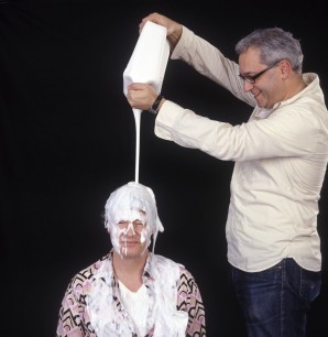
Photograph of Antony Buck pouring out skin unfriendly products over Ren Co-Founder Robert Calcraft. Courtesy of Ren Skincare.
This article first appeared in Cassone: The International Online Magazine of Art and Art Books in the October 2011 issue.